Aussie Divers
Why divers? Why Australians? There are several diffferent threads to this story, starting with the Australians; I happened to meet a visiting Australian who told me his two daughters were keen swimmers so motivated by the prospect of maing the national team for the next Olympics that they were getting up to train at 4.30 a.m. every day. Whereas it is a standing joke among our friends that mid day is known as teenage dawn. They must build them differently in New South Wales.
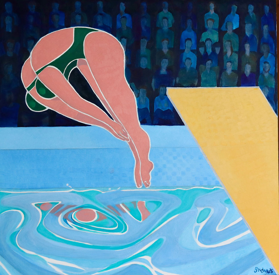
Them my framer offered me two 1.00 metre square deep edge canvases that she thought I might be able to use as she knew I liked painting on bigger canvases than are customary in Surrey where pokey but picturesque houses call for dinky sized pictures. I have painted a few this size but even for me there was a chalenge inthe square format. Rectangular shapes are easier to work with because there is a major and a minor dimension, whether you are working in a portrait or landscape format. In my sketchbook I started on outlines for the two canvases, thinking about where the centre of interest should be set.
The two swimmers somehow became divers - I would have to show more than human figures and water - and while thinking about diving platforms and the tiered banks of spectators at a swimming gala I remembered Ed Ruscha's dynamic gas station paintings. I knew that I could introduce a strong diagonal element that would disrupt the balance of the square. So I did. I started the board from the extreme bottom right and extended it up to the left until it felt about right when compared to the two blue areas.
Two blues? I knew that I could have a very dark treatment for the spectators, implying their distance from the divers, where only their faces would act as sparkle in the gloom and also that the water would be highly illuminated from inside the water as well as from the light falling on the divers. The tiling around the pool would be similar in colour to the water. I hesitated over the barrier to the spectators. If I showed flags draped over it, there would have to be flags among the spectators as well and that whole are would become to literal and discordand. Similarly I decided not to have slogans or logos. I wanted simplicity.
Two blues, so automatically that meant that the diving board should be a complementary yellow and blue and yellow combine to make the Aussie green. It felt like magic.


Comments